
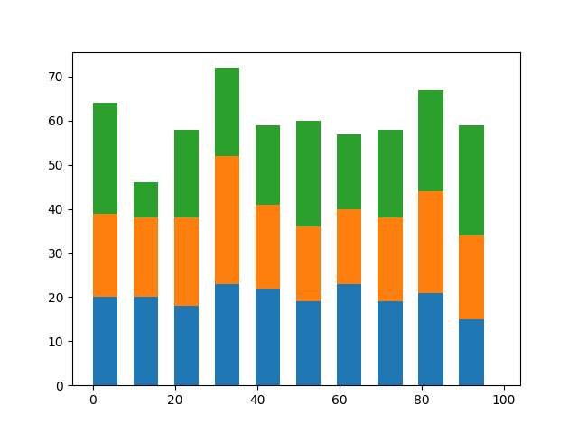
積み上げグラフとは下図のように複数のデータを重ねたグラフのことで、複数要素の割合を示すために使われます。
棒グラフ
棒グラフで積み上げグラフを描画する場合は、以下の順番で行います。
- 1つめのデータを描画
- barのbottomオプションを使って、1つめのデータの上から2つめのデータを描画
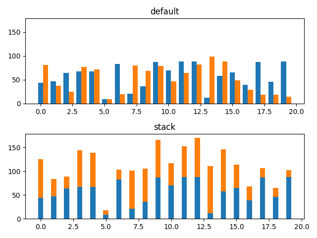
下図は棒グラフを横に並べたパターン(default)と積み上げグラフ(stack)を比較したものです。
import numpy as np
import matplotlib.pyplot as plt

np.random.seed(0)

# 目盛り(x方向)とランダム値(y方向)を生成
x1 = [i for i in range(20)]
y1 = [np.random.randint(0, 100) for i in range(20)]

# 2つ目のデータを作成
y2 = [np.random.randint(0, 100) for i in range(20)]

fig, ax = plt.subplots(2, sharey=True)

# 横に並べて描画
# x座標は横に並べるために位置をシフト
ax[0].bar(x1, y1, width=0.4)
ax[0].bar(np.array(x1) + 0.4, y2, width=0.4)

# y1の高さをbottomとして2つめのデータを描画
ax[1].bar(x1, y1, width=0.4)
ax[1].bar(x1, y2, bottom=y1, width=0.4)

# グラフタイトルの設定
ax[0].set_title('default')
ax[1].set_title('stack')

fig.tight_layout()

plt.show()
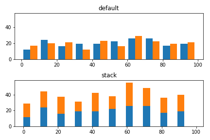
ヒストグラム
ヒストグラムの場合はオプションでstacked=Trueを設定することで積み上げグラフを作成できます。
# ランダムな3つのデータ群を作成
x1 = [np.random.randint(0, 100) for i in range(200)]
x2 = [np.random.randint(0, 100) for i in range(200)]

fig, ax = plt.subplots(2, sharey=True)

# 2つのデータを並べたグラフを描画
ax[0].hist([x1, x2], width=4)

# 2つのデータをstack
ax[1].hist([x1, x2], width=4, stacked=True)

# タイトルの設定
ax[0].set_title('default')
ax[1].set_title('stack')

fig.tight_layout()

plt.show()
ちなみに、bottomを設定することでも積み上げグラフを作成できます。ただ、データ数が多くなった時にコードを書くのがちょっと面倒になりますので、上のやり方のほうがよいかなと思います。
# 横に並べて描画
ax[0].hist([x1, x2], width=4)

# 1つめのデータのbinごとの個数を取得して2つめのhist()のbottomに設定
counts, _, _ = ax[1].hist(x1, width=4)
ax[1].hist(x2, bottom=counts, width=4)

# グラフタイトルの設定
ax[0].set_title('default')
ax[1].set_title('stack')

fig.tight_layout()

plt.show()
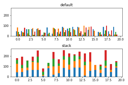
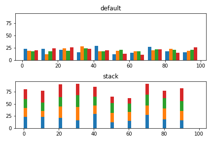
3つ以上の積み上げグラフ
データ数が3つ以上ある場合も同様の考え方で作成できます。
棒グラフ
import numpy as np
import matplotlib.pyplot as plt

np.random.seed(0)

# 目盛り(x方向)とランダム値(y方向)を生成
# あとの処理のためにデータをnumpy形式に変換しておく
x1 = np.array([i for i in range(20)])
y1 = np.array([np.random.randint(0, 100) for i in range(20)])

# 2つ目のデータ
y2 = np.array([np.random.randint(0, 100) for i in range(20)])  # 2つ目のデータ
y3 = np.array([np.random.randint(0, 100) for i in range(20)])  # 3つ目のデータ
y4 = np.array([np.random.randint(0, 100) for i in range(20)])  # 4つ目のデータ

fig, ax = plt.subplots(2, sharey=True)

# 横に並べて描画
# x座標は横に並べるために位置をシフト
ax[0].bar(x1 - 0.3, y1, width=0.2)
ax[0].bar(x1 - 0.1, y2, width=0.2)
ax[0].bar(x1 + 0.1, y3, width=0.2)
ax[0].bar(x1 + 0.3, y4, width=0.2)

# 2つ目以降のデータは前のデータの和をbottomに設定
ax[1].bar(x1, y1, width=0.4)
ax[1].bar(x1, y2, bottom=y1, width=0.4)
ax[1].bar(x1, y3, bottom=y1+y2, width=0.4)
ax[1].bar(x1, y4, bottom=y1+y2+y3, width=0.4)

# グラフタイトルの設定
ax[0].set_title('default')
ax[1].set_title('stack')

fig.tight_layout()
plt.show()
ヒストグラム
データが3つ以上ある場合も、stacked=Trueで対応可能です。
# ランダムな4つのデータ群を作成
x1 = [np.random.randint(0, 100) for i in range(200)]
x2 = [np.random.randint(0, 100) for i in range(200)]
x3 = [np.random.randint(0, 100) for i in range(200)]
x4 = [np.random.randint(0, 100) for i in range(200)]

fig, ax = plt.subplots(2, sharey=True)

# 4つのデータを並べたグラフを描画
ax[0].hist([x1, x2, x3, x4], width=2)

# 4つのデータをstack
ax[1].hist([x1, x2, x3, x4], width=2, stacked=True)

# タイトルの設定
ax[0].set_title('default')
ax[1].set_title('stack')

fig.tight_layout()

plt.show()