複数のグラフを1つのfigureに描画する方法として、subplots()を使う方法と、add_subplot()を使う方法とがあります。特に、add_subplot()の位置設定の方法が分かりづらかったため、自分なりにまとめてみました。
準備
まずは下準備です。ライブラリのインポートを行い、表示用のデータを作成しておきます。
import numpy as np
import matplotlib.pyplot as plt

np.random.seed(0)

# データの作成
# 散布図
x_scatter = [np.random.randint(0, 100) for i in range(200)]
y_scatter = [np.random.randint(0, 100) for i in range(200)]

# 棒グラフ
x_bar = [i for i in range(20)]
y_bar = [np.random.randint(0, 100) for i in range(20)]

# 折れ線グラフ
x_plot = [i for i in range(20)]
y_plot = [np.random.randint(0, 100) for i in range(20)]

# ヒストグラム
x_hist = [np.random.randn()*100 for i in range(100)]
subplots()
plt.subplots()を使うことで、figureを作った時点でaxの配置を定義することができます。
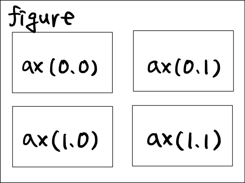
下はaxが2×2で並んだfigureを作成し、それぞれに散布図、棒グラフ、折れ線グラフ、ヒストグラムを描画するコードです。plt.subplots(2,2)の戻り値axは2×2のndarray形式で与えられますので、スライスを使ってどのaxに描画するかを指定します。
axの配置は下の図の通りで、axの数が増えてもこの規則に従います。
# グラフの描画
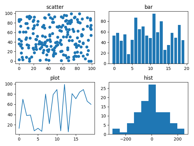
fig, ax = plt.subplots(2, 2)
# 散布図
ax[0, 0].scatter(x_scatter, y_scatter)
ax[0 ,0].set_title('scatter')
# 棒グラフ
ax[0, 1].bar(x_bar, y_bar)
ax[0, 1].set_title('bar')
# 折れ線グラフ
ax[1, 0].plot(x_plot, y_plot)
ax[1, 0].set_title('plot')
# ヒストグラム
ax[1, 1].hist(x_hist, bins=10)
ax[1, 1].set_title('hist')
fig.tight_layout()
plt.show()

1行 or 1列のfigure
なお、行もしくは列が1つしかない場合、デフォルトでaxは1Dのndarrayとして返ってきます。コードを書く時に、axの指定方法が1Dと2Dとで異なるとちょっと面倒です。
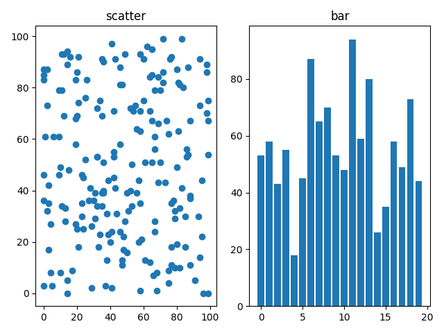
fig, ax = plt.subplots(1, 2)

# 散布図
ax[0].scatter(x_scatter, y_scatter)
ax[0].set_title('scatter')

# 棒グラフ
ax[1].bar(x_bar, y_bar)
ax[1].set_title('bar')
そこで、squeeze=Falseを指定すると、2Dの1×2のndarrayとして戻ってきます。これなら、axの数によらず同じ表現でグラフの位置指定ができるようになって便利です。
# グラフの描画
fig, ax = plt.subplots(1, 2, squeeze=False)

# 散布図
ax[0, 0].scatter(x_scatter, y_scatter)
ax[0, 0].set_title('scatter')

# 棒グラフ
ax[0, 1].bar(x_bar, y_bar)
ax[0, 1].set_title('bar')
add_subplot()
plt.subplot()ははじめにaxの枠を作ってしまう処理だったのですが、add_subplot()は順次、figureにaxを追加していくという処理になります。
fig = plt.figure()

# 散布図
ax1 = fig.add_subplot(2, 2, 1)
ax1.scatter(x_scatter, y_scatter)
ax1.set_title('scatter')

# 棒グラフ
ax2 = fig.add_subplot(2, 2, 2)
ax2.bar(x_bar, y_bar)
ax2.set_title('bar')

# 折れ線グラフ
ax3 = fig.add_subplot(2, 2, 3)
ax3.plot(x_plot, y_plot)
ax3.set_title('plot')

# ヒストグラム
ax4 = fig.add_subplot(2, 2, 4)
ax4.hist(x_hist, bins=10)
ax4.set_title('hist')

fig.tight_layout()

plt.show()
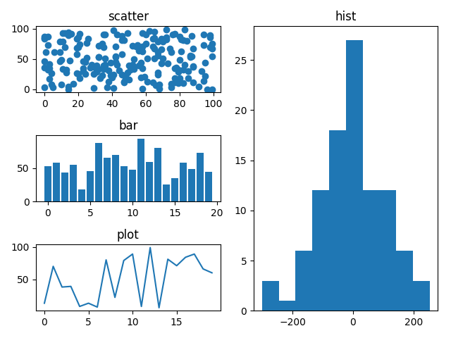
白紙のfigureにaxを追加していくため、add_subplot()では以下のように様々なグラフのサイズが混ざったfigureの描画も行うことができます。
fig = plt.figure()

# 散布図
ax1 = fig.add_subplot(3, 2, 1)
ax1.scatter(x_scatter, y_scatter)
ax1.set_title('scatter')

# 棒グラフ
ax2 = fig.add_subplot(3, 2, 3)
ax2.bar(x_bar, y_bar)
ax2.set_title('bar')

# 折れ線グラフ
ax3 = fig.add_subplot(3, 2, 5)
ax3.plot(x_plot, y_plot)
ax3.set_title('plot')

# ヒストグラム
ax4 = fig.add_subplot(1, 2, 2)
ax4.hist(x_hist, bins=10)
ax4.set_title('hist')

fig.tight_layout()

plt.show()
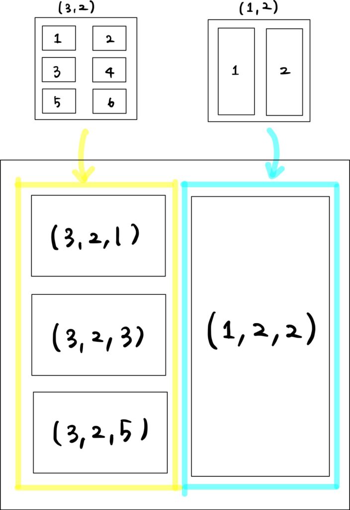
ぱっと見、add_subplot()の数字の指定がなかなか分かりづらいですが、ざっくりとaxの配置の流れは、
- add_subplot()は指定された数のaxを配置した (仮想の) figureを作成
- 仮想のfigureを元にaxを配置するスペースを決定
こんな感じみたいです。
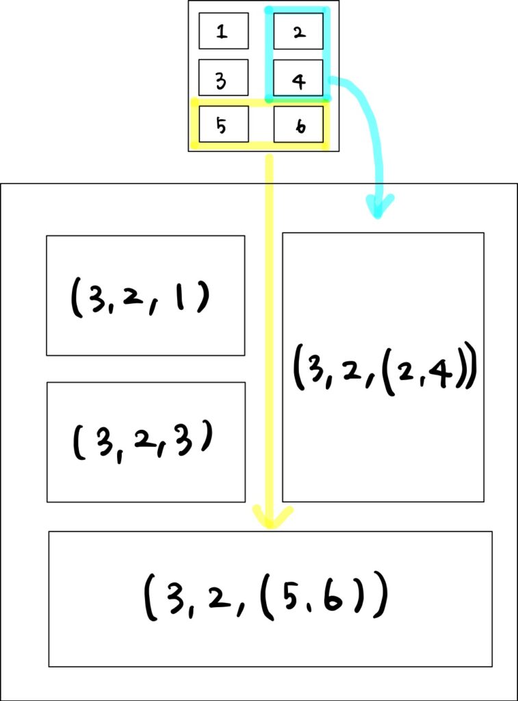
つまり、上のコードのax1 = fig.add_subplot(3, 2, 1)の意味としては、① figureに3行2列のaxを配置するようにキャンバスを分割し、② インデックス1のスペースに空のax1を設定することを意味します (下図黄色)。
同様に、ax4 = fig.add_subplot(1, 2, 2)は、① figureに1行2列のaxを配置するようにキャンバスを分割し、② インデックス2のスペースに空のax4を設定します (下図水色)。
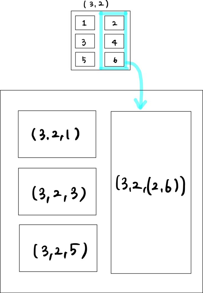
また、ax4の別の設定方法として、以下のような書き方もできます。
ax4 = fig.add_subplot(3, 2, (2, 6))
こちらは、① 3行2列のaxを配置するように分割したfigureを作成し、② インデックス2〜6の範囲を結合したスペースにax4を設定することを意味します。
サイズの異なるグラフ群の配置
この考えを拡張させると、下のようなイレギュラーな配置もできるようになります。
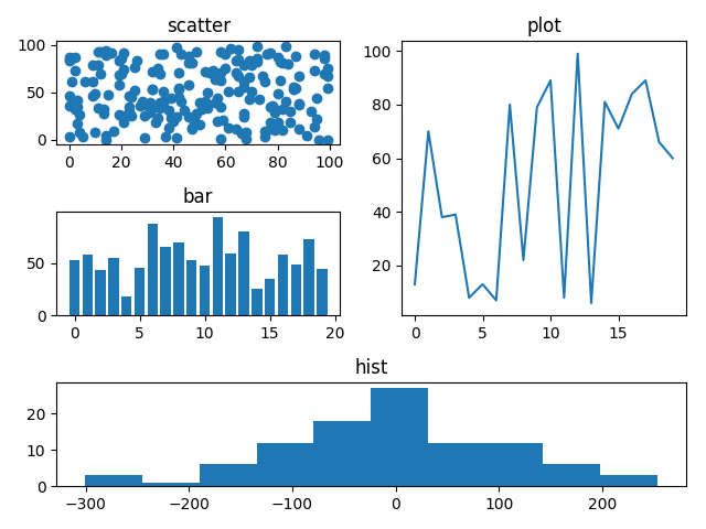
fig = plt.figure()

# 散布図
ax1 = fig.add_subplot(3, 2, 1)
ax1.scatter(x_scatter, y_scatter)
ax1.set_title('scatter')

# 棒グラフ
ax2 = fig.add_subplot(3, 2, 3)
ax2.bar(x_bar, y_bar)
ax2.set_title('bar')

# 折れ線グラフ
ax3 = fig.add_subplot(3, 2, (2, 4))
ax3.plot(x_plot, y_plot)
ax3.set_title('plot')

# ヒストグラム
ax4 = fig.add_subplot(3, 2, (5, 6))
ax4.hist(x_hist, bins=10)
ax4.set_title('hist')

fig.tight_layout()

plt.show()
上記コードの意味合いとしては下に示すとおりです。複数のaxのスペースを結合することで、より柔軟な配置ができるようになりました。