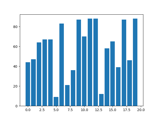
基本の棒グラフ
まずは、ライブラリのインポートとランダムデータを作成します。
import numpy as np
import matplotlib.pyplot as plt

np.random.seed(0)

# 目盛り(x方向)とランダム値(y方向)を生成
x = [i for i in range(20)]
y = [np.random.randint(0, 100) for i in range(20)]
何も設定をしないで棒グラフを描画した結果は下の図のようになります。
_, ax = plt.subplots()
ax.bar(x, y)

plt.show()
バーの幅の変更
バーの幅はwidthで設定できます。
ax.bar(x, y, width=0.4)

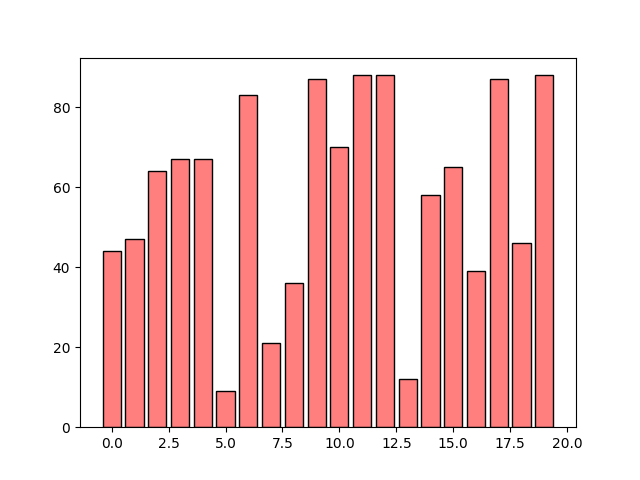
バーの塗りつぶしと線の色の変更
バーの塗りつぶし色はcolor、線の色はedgecolorで設定できます。
ax.bar(x, y, color=[1.0, 0.0, 0.0, 0.5], edgecolor='black')
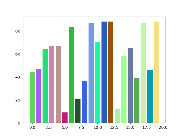
リストでの色指定
colorオプションはリストで与えることもできます。
# ランダムなRGBのリストを作成
colors = [[np.random.rand(), np.random.rand(), np.random.rand()] for i in range(20)]

ax.bar(x, y, color=colors)
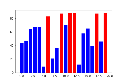
ということは、値によってバーの色を変えることもできるということですね。値が大きい箇所が目立つように色を変えてみました。
# 80未満を青、80以上を赤で表示
colors = [[0., 0., 1.] if val < 80 else [1., 0., 0.] for val in y]

ax.bar(x, y, color=colors)
ちなみに、カラーマップを適用するのは少し厄介みたいですので、またの機会に回します。
バーの線の太さと形状の変更
バーの線の太さはlinewidth、線のスタイルはlinestyleで設定できます。
ax.bar(x, y, color=[1.0, 0.0, 0.0, 0.5], edgecolor='black', linewidth=2, linestyle='--')

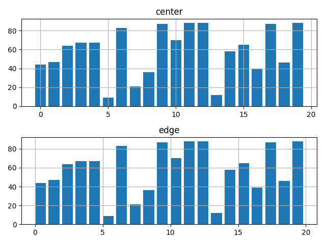
バーの位置の設定
alignオプションを使用すればバーの位置を変えられます。デフォルトは’center’で、目盛りの中心にバーがくるようになっています。
fig, ax = plt.subplots(2)

# 比較のため、配置がdefault('center')と'edge'のグラフを作成
ax[0].bar(x, y, align='center')  # default
ax[1].bar(x, y, align='edge')

ax[0].set_title('center')
ax[1].set_title('edge')

# 軸の設定
x_major_ticks = np.arange(0, 21, 5)

ax[0].set_xticks(x_major_ticks)
ax[1].set_xticks(x_major_ticks)

# gridの描画
ax[0].grid()
ax[1].grid()

fig.tight_layout()
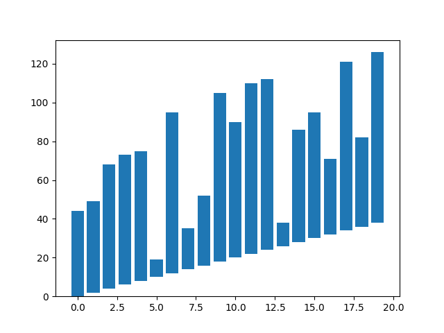
y座標のシフト
bottomオプションでy座標側のシフト量を設定することができます。
# x座標の値に応じたシフト量を設定
bottom = [i * 2 for i in range(20)]

ax.bar(x, y, bottom=bottom)
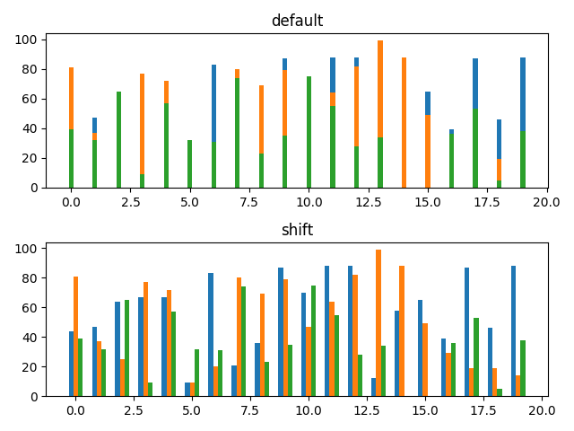
複数データを並べて表示
複数のデータを同じ棒グラフ上に描画すると、重なって表示されてしまいます(下図デフォルト参照)。とはいえ、bar()の位置の設定は’edge’と’center’のみのため、3つ以上のデータを並べたい場合にはうまくいきません。
このような場合、xの値そのものをずらすことで複数のデータを並べて表示することができるようです(ちょっと力技の印象はありますが)。
x = [i for i in range(20)]

# xの位置をバーの幅分左に移動
x1 = np.array(x) - 0.2
y1 = [np.random.randint(0, 100) for i in range(20)]

# xの位置の移動なし
x2 = np.array(x)
y2 = [np.random.randint(0, 100) for i in range(20)]

# xの位置をバーの幅分右に移動
x3 = np.array(x) + 0.2
y3 = [np.random.randint(0, 100) for i in range(20)]

fig, ax = plt.subplots(2, sharey=True)

# デフォルト
ax[0].bar(x, y1, width=0.2)
ax[0].bar(x, y2, width=0.2)
ax[0].bar(x, y3, width=0.2)

# 位置をずらして並べて表示
ax[1].bar(x1, y1, width=0.2)
ax[1].bar(x2, y2, width=0.2)
ax[1].bar(x3, y3, width=0.2)

ax[0].set_title('default')
ax[1].set_title('shift')

plt.show()