
matplotlibで描画可能なグラフのうち、使用頻度が高いと思われるもの (いままで使ったことのあるもの) について以下にメモします。
各描画コードの先頭には以下を記載しておきます。
import numpy as np
import matplotlib.pyplot as plt

np.random.seed(0)  # オプション:ランダム値を固定
散布図
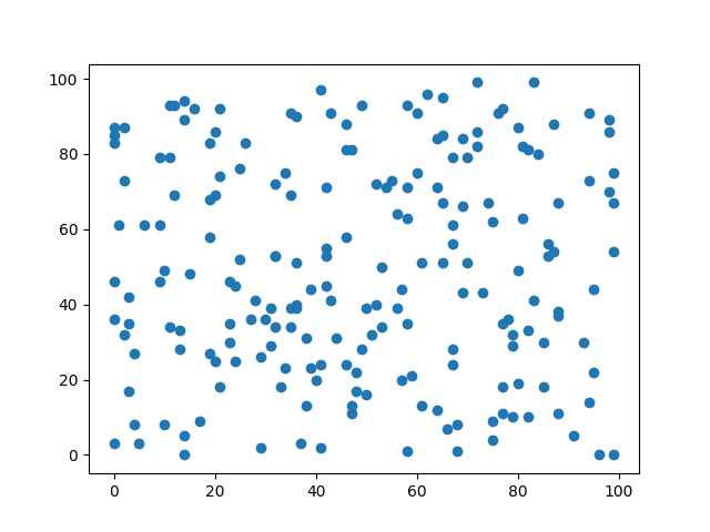
# 0~100のランダム値(整数)を生成
x = [np.random.randint(0, 100) for i in range(200)]
y = [np.random.randint(0, 100) for i in range(200)]

# 散布図
_, ax = plt.subplots()
ax.scatter(x, y)

plt.show()
折れ線グラフ
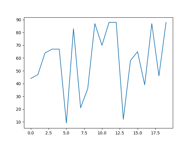
# 0~100のランダム値(整数)を生成
x = [i for i in range(20)]
y = [np.random.randint(0, 100) for i in range(20)]

# 折れ線グラフ
_, ax = plt.subplots()
ax.plot(x, y)

plt.show()
棒グラフ
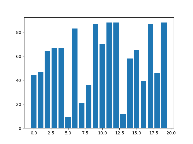
# 目盛り(x方向)とランダム値(y方向)を生成
x = [i for i in range(20)]
y = [np.random.randint(0, 100) for i in range(20)]

# 棒グラフ
_, ax = plt.subplots()
ax.bar(x, y)

plt.show()
ヒストグラム
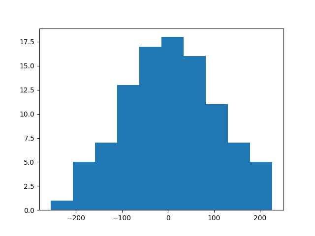
# 正規分布にもとづくランダム値を生成
x = [np.random.randn()*100 for i in range(100)]

# ヒストグラム
_, ax = plt.subplots()
ax.hist(x, bins=10)

plt.show()